

GOLD PRICE PROJECTIONS
We don’t know what the gold price will be, but studying the history of prices can be invaluable.
Do you want regular updates on what’s happening in the Gold Market?
Subscribe to my FREE newsletter for insider insights and clear breakdowns of the forces that drive gold prices — so you can invest with confidence.
Click here to receive the FREE newsletter - you will be taken to a LinkedIn Page where you will also need to click Subscribe

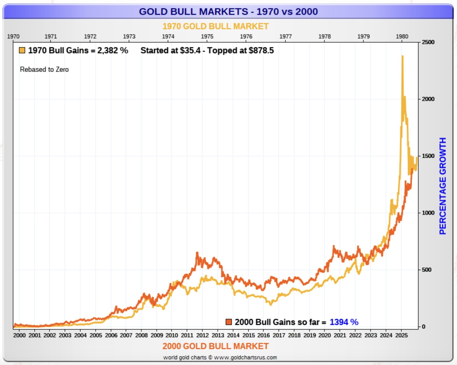
Gold Bull Markets: 1970 vs 2000
This graph compares the current bull market (the red line) with the bull market in the 1970’s (the orange line). If history was to repeat itself, the gold price could still move up significantly from these levels.
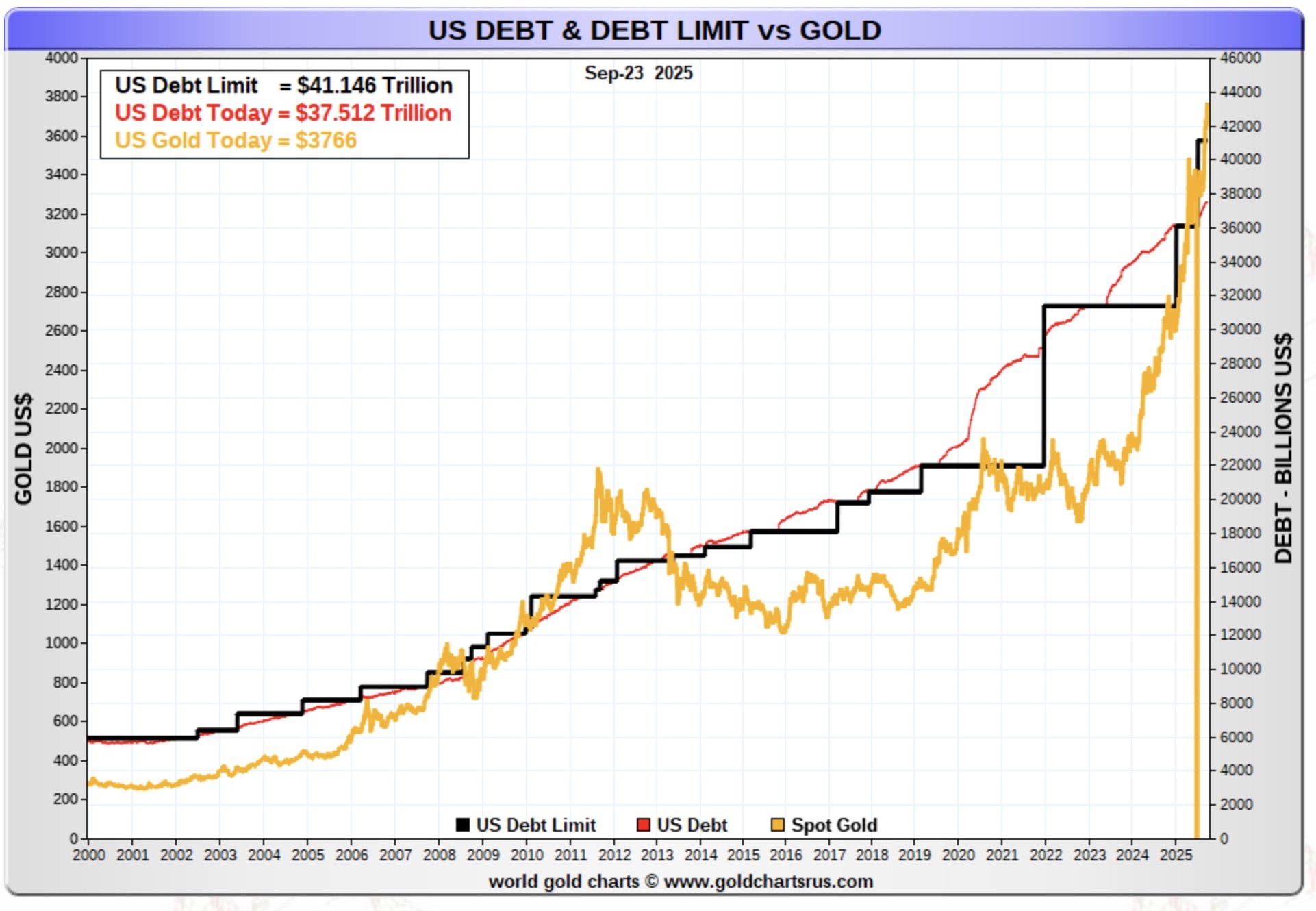
US Debt Levels vs Gold Price
The next graph compares the gold price (the orange line) to US levels of debt (the red line) as well as the US debt limit (the black line). As you can see, although the gold price goes up and down (and debt seems to just go up!), over the longer term, the gold price seems to have risen with increasing debt
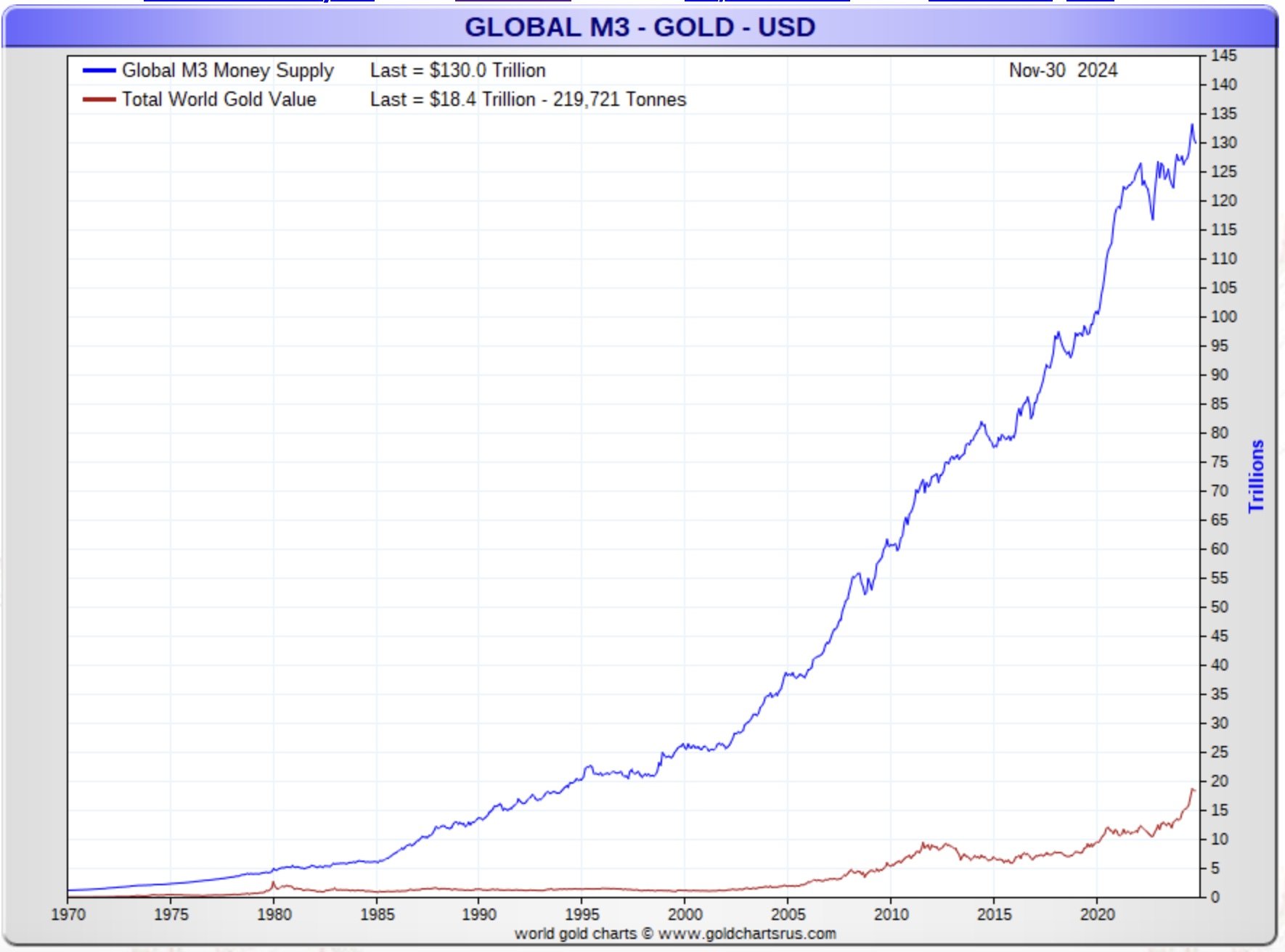
Gold vs Money Supply
As you know, you can’t print gold, but you can print money. This graph compares the growth (in value terms) in M3 money supply (the blue line) - M3 is traditionally used by economists to estimate the entire money supply within an economy and by governments to direct policy and control inflation over medium and long-term periods - with the value of gold in the market (the red line). As you can see, despite there being a lot more money in the system, the gold price has increased far less.
Future Forecasts for Gold
If you’re only interested in the future, then it’s good to see what previous forecasts have done. Here’s one from “In Gold We Trust” - they did two forecasts, a base case and and inflation one (the dotted lines). The actual price being the dark line between the two dotted lines.
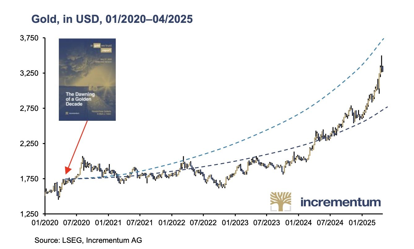
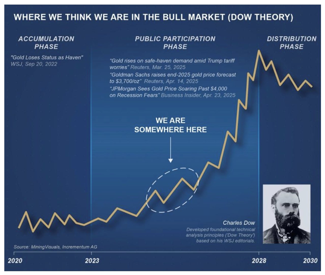
And this is what they’re forecasting…..
The full report by In Gold We Trust is VERY long, but it’s a great read.
Take a look:
